94→ 88→ 75→ 51. Those digits show the importance of UI/UX design nowadays:
- 94% of first impressions are design-related
- 88% of online consumers won't return to a poorly optimized website
- 75% perceive website design as company's proof of credibility
- 51% of aged 55+ prefer using a voice user interface
These numbers aren't the only confirmation of UI/UX importance.
Throughout human history, design — and experiences of people who interact with it — have been vital: for house building, construction of public spaces, fashion, etc. To stay at the forefront of progressive changes in the digital sector, we've gathered the top 5 best UI/UX design trends that exist within it right now.
Minimalism
Minimalism seems to always be among the most stable and somewhat universal design approaches. Reducing the number of separate web pages and buttons for users to find items or information they need is very efficient for landing pages and e-commerce resources. The abundance of visual stimuli that can work well for, for instance, artists’ portfolio websites will hurt the commercial goals of commercial pages.
The effect of minimalism is also related to the amount of information we receive daily. Users’ eyes can relax from toxic side banners and blinking popups and enjoy straight-to-the-point navigation and copy.
Blur it and you will have a minimalistic background for the landing page
Color Theory
Professional designers know that colors have a psychological impact and can create a particular mood. To create interfaces, UI designers often apply color theory. They use the same color with different values to distinguish primary and secondary buttons. Often, they work around with three different colors: main (for background), secondary (for text), and accent color (for links, buttons, important highlights). Using contrasts between accent color and the main one, designers guide users through the interface, split different sections of the app, inform users about errors when they’re filling forms, etc.
Color theory is especially useful when a designer develops a color palette, drawing inspiration from movies, nature, and works of art.
Additional note: to check if the colors in your interface are as good as you think they are. Switch from the designer monitor with high resolution and bright, deep colors to usual monitors — or, even better, test on old smartphone models. People generally don’t have access to cool monitors — it’s important to check if your app is as beautiful on as many devices as possible.
Voice User Interface
User Interface is not only about visuals, however. More developers start to make sure their apps are compatible with screen readers. They integrate into them voice-recognition technology. The latter is usually complex conversational AI which is expensive to develop and to integrate with a digital solution, but it is so worth it.
In general, about 45% of American users would be happy to interact with apps via voice. Some of them are big fans of Siri and Alexa and like to talk to AI, but others appreciate the accessibility. For instance, 51% of people older than 55 are using voice UI. It’s challenging for them both to get used to new interfaces and tiring to read in small fonts. There are also people with dyslexia, shortsighted people, people who have difficulties focusing on the text, and many, many others. Voice interfaces will help you reach people who are usually underserved.
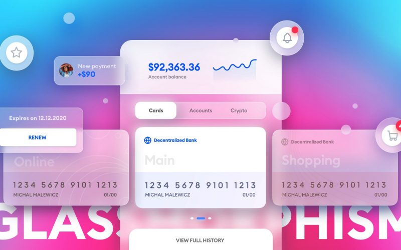
Glassmorphism
This effect shouldn't be confused with blurring, as glassmorphism is also about the form. Yes, it still has to do with the blurred background, but with particular shapes. Glassmorphism creates glass-like (obviously), translucent objects, it works with multiple layers and bright, vibrant colors. The objects are often enclosed in glowing, subtle borders.
Designers often use the style for splash screens and backgrounds in apps — it’s often a blurred, transparent picture with an overlay effect for brightness.
Unique 2D Illustration and Icons
2D illustrations seem to have a revival this year. App designers combine pencil drawing with different elements of the UI, flat 2D images are used for products’ main pages, customer guides, in marketing campaigns. Outline illustrations are a bit retro, but look stylish as a visual component of businesses’ blog articles and product demos.
Unique icons, on the other hand, become another way to separate oneself from the competitors. Of course, the onset of universal icons remains the same. Lots of people have never used a floppy disk, but they still clock on it to save documents. Pencil still always means editing. But there's a space for new icons and meanings.
When designing new icons for your app, remember that their meaning should be understandable from the start. The more time you spend explaining the symbols you use, the more users will be struggling to use your solution.
Final thought
Website design can be compared to the fashion industry, where the trends change annually. Just like with clothes or haircuts, many people use outdated UI/UX patterns and lose momentum, money, and clients.
The most important thing in creating pleasing interfaces and digital experiences one would want to return to is having a lot of conversations with your users. They will tell you which trends they really appreciate and which ones are just fancy wrapping for lack of clarity in the app's value proposition.
